
Wayfinding and Signage: Practical Strategies for Clear Public Navigation
- The Sign Company UK

- 3 hours ago
- 7 min read
You rely on signs every day without thinking, but effective wayfinding does more than point the way — it reduces stress, saves time and makes spaces usable for everyone. When you design clear, consistent and accessible wayfinding signs, people find destinations faster and your space performs better.
This post shows how practical principles, smart solutions and straightforward implementation turn confusing corridors into intuitive journeys you control. Expect concise guidance you can apply whether you're planning a small building, a public campus or a large complex. The Sign Company UK can help you achieve these results with expertly designed wayfinding signs.
Key Takeaways
Start with clear goals to guide navigation design decisions.
Use consistent, accessible elements to make directions understandable.
Follow pragmatic implementation steps to ensure compliance and usability.

Principles of Effective Navigation
Good navigation reduces user effort, prevents confusion and speeds up task completion. Focus on predictable routes, clear priorities, and readable wayfinding signs so people move efficiently and confidently through a space.
Human-Centred Design Approaches
Design around real user goals and constraints. Conduct short contextual interviews and observe representative users moving through the space to identify decision points, common detours and accessibility barriers. Use personas only to capture mobility types (ambulatory, wheeled, visual impairment) and typical tasks such as transferring platforms, finding toilets or exiting.
Prioritise inclusive materials and placements: tactile strips at 300–900 mm height, high-contrast wayfinding signs at 1.4–1.6 m for sighted users, and audible cues at entrances and lifts. Prototype with cardboard or digital mock-ups and test wayfinding sequences rather than isolated signs. Iterate based on timed wayfinding tasks and error counts.
Cognitive Mapping and User Behaviour
People build mental maps from landmarks and sequences, not every sign. Place distinctive, consistent landmarks at nodes and intersections so users can anchor routes mentally. Use numbered nodes, colour bands or pictograms to show route progression and reduce reliance on memory.
Minimise cognitive load by grouping directions into actionable elements per sign (destination, distance or direction, primary mode). Present upcoming decision points at least 10–20 metres in advance in walking environments and at each transfer node in transport settings. Reinforce routes with repeatable cues — a floor strip, a repeated icon, or a consistent lighting change.
Hierarchy and Consistency in Messaging
Establish a clear information hierarchy: primary destinations first (e.g., Platforms 1–4), secondary facilities second (toilets, lifts), and tertiary details last (opening hours). Use font size, weight and colour to reflect that hierarchy; for example, primary text at 32–40 pt, secondary at 20–24 pt for typical viewing distances in public buildings.
Create a documented signage system: list of approved icons, exact colour swatches (Pantone/RGB), typographic scale, and placement guidelines. Apply the system across maps, directional signs and digital displays so users encounter the same language and visual cues at each decision point.
Visual Clarity and Legibility Standards
Legibility depends on typeface, contrast, spacing and viewing distance. Select a humanist sans-serif with open counters and avoid condensed weights for long distances. Maintain a minimum contrast ratio of 7:1 for critical text against background for normal vision and 4.5:1 for larger display text.
Use these practical rules:
Minimum character height: 20 mm for every 10 m of viewing distance.
Line spacing: 120–140% of font size to aid scanning.
Pictogram size: at least 150 mm for recognition at average approach speeds.
Place wayfinding signs at consistent sightlines and angle them toward pedestrian flow. Reduce clutter by limiting text to 6–10 words and using pictograms for universal concepts. Test legibility in real lighting conditions, including glare and low light, before final production.
Types of Directional Solutions
Directional systems blend fixed, digital and identity-led elements to guide people quickly and reduce decision points. Each approach suits different budgets, user needs and maintenance regimes, so choose based on footfall, accessibility and update frequency. The Sign Company UK offers a range of wayfinding signs to suit every environment.
Static Signage Systems
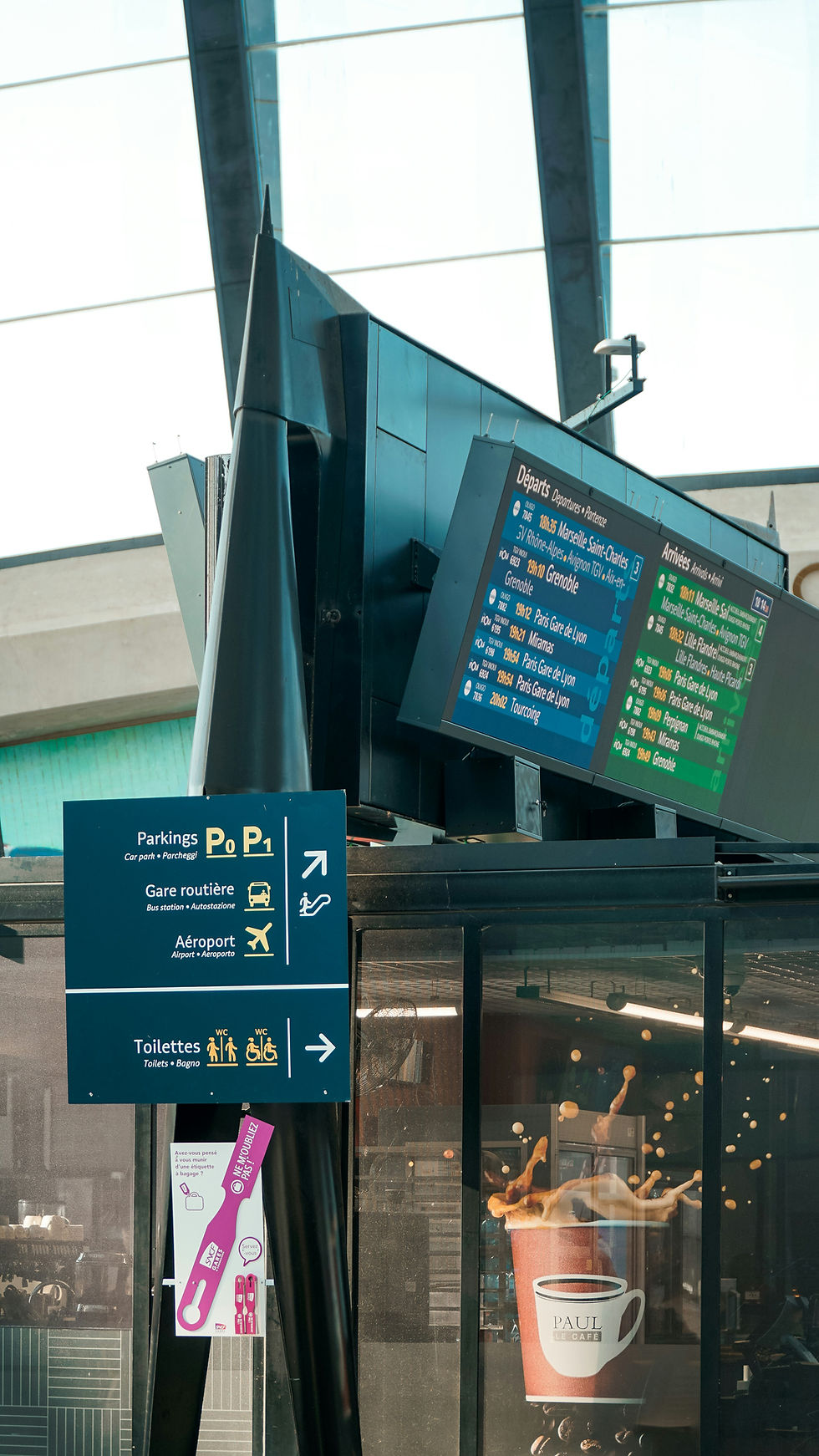
Static signage covers tactile, printed and metal wayfinding signs that remain constant until physically changed. You should prioritise materials like aluminium or acrylic for durability, non‑glare finishes for legibility and high‑contrast typefaces such as Frutiger or DIN for wayfinding clarity.
Place wayfinding signs at decision points: entries, intersections, lift lobbies and stairheads. Include essential content only — destination name, direction arrow, distance or level — and position text at eye height (1.4–1.6 m for standing adults; consider lower mounting for children or wheelchair users). Use braille and raised letters where regulations or user needs demand them.
Maintenance planning matters: design for replaceable panels or modular mounts to simplify updates. Numbering systems and consistent pictograms speed orientation in complex buildings. For outdoor systems, choose UV‑stable inks and corrosion‑resistant fixings.
Digital and Interactive Displays
Digital displays offer real‑time routing, dynamic schedules and wayfinding that adapts to congestion or closures. You should use 55–75 inch screens in high‑traffic zones and 10–22 inch touch kiosks for point‑of‑decision interaction; ensure screens sit within reach (900–1200 mm) and at readable angles.
Integrate software with building management, transit feeds and accessibility modes (high contrast, audio cues, larger text). Provide clear fallback content for network outages: cached maps, static instructions and emergency messages. Design interfaces with large touch targets (minimum 9–10 mm) and simple task flows — search, route, print/share — to reduce user effort.
Consider power, cabling, cooling and vandal resistance. Plan for remote content management, analytics to track usage, and GDPR‑compliant logging if you capture user interactions.

Environmental Graphics and Branding
Environmental graphics combine large‑scale graphics, floor patterns, lighting and architectural elements to create legible movement cues. Use colour bands, corridor murals, or patterned flooring to indicate routes to zones (for example: blue stripe to clinics, green stripe to administration).
Coordinate with your brand palette but maintain functional contrast for readability. Apply modular graphic elements at consistent intervals so users receive confirmation at 5–10 metre checkpoints. Lighting cues — uplighting, illuminated coves — can emphasise paths and focal points at night.
Ensure materials meet slip, fire and cleaning standards for the setting. Test with real users to confirm that branded elements do not obscure functional information; adjust scale and colour based on daylight and artificial light conditions.
Implementation Processes and Best Practices
You will assess site conditions, define user needs, choose durable materials, and set a schedule for installation and upkeep. Prioritise visibility, accessibility, and consistency to ensure wayfinding signs guide people effectively and last under local conditions.
Site Assessment and Needs Analysis
Survey pedestrian flows at peak and off-peak times and map origin–destination pairs to identify decision points and bottlenecks. Record dimensions, sight lines, lighting conditions, pavement gradients, and surface materials for each proposed wayfinding sign location.
Engage stakeholders: operations staff, facilities, disabled-access groups, and local authorities. Collect incident reports and user feedback to prioritise wayfinding needs and safety-critical placements.
Create an inventory of existing wayfinding signs with photos, GPS points, and condition ratings. Use a matrix that lists user type, function (orient, direct, identify), and priority level to decide what to keep, replace, or add.
Document regulatory requirements: building codes, tactile and Braille standards, and local planning permissions. Translate those rules into measurable criteria for sign height, mounting, contrast ratios, and finger-reach clearances.
Design and Material Selection
Specify typography, iconography, and colour palettes with contrast ratios that meet luminance standards for legibility at the expected viewing distance. Use type sizes and stroke widths calculated for the longest read distance in metres.
Choose substrates and finishes based on environment: aluminium with anti-graffiti laminate for high-traffic urban exteriors; PVC-foam or anodised aluminium for covered walkways; high-impact polycarbonate for transit hubs. Match fasteners and brackets to substrate and wind-load calculations.
Select illumination types where required: LED backlighting for night legibility, photoluminescent strips for emergency egress, and glare-controlled lenses near reflective surfaces. Specify mounting methods to achieve required viewing heights and angles while preventing vandalism.
Include tactile and audio options where law or user need dictates. Define testing procedures for prototypes: visibility at set distances, tactile compliance with guidelines, and accelerated weathering tests for UV and salt exposure.
Installation and Maintenance Guidelines
Create an installation pack with site drawings, fixing details, torque specifications, and step-by-step sequences to prevent rework. Coordinate works with utilities and traffic management; schedule overnight or low-traffic windows when necessary.
Train installers on mounting tolerances, plumb and level requirements, and secure anchoring into the identified substrate types. Photograph each installation with a checklist to confirm sight lines, illumination, and compliance with the approved design.
Set a maintenance plan with inspection intervals, cleaning methods, and a spare-parts list. Use a digital asset register with photo logs, condition codes, and replacement lead times to manage lifecycle costs and reduce downtime.
Define rapid-replacement procedures for vandalised or damaged wayfinding signs, including temporary wayfinding solutions. Track metrics: mean time to repair, number of damaged units per month, and user-reported wayfinding failures to inform future design adjustments.
Regulatory Standards and Accessibility
You need to meet legal requirements and make wayfinding signs usable for everyone. Focus on measurable standards, clear sightlines, readable typography, and the tactile and auditory features required for accessibility. The Sign Company UK can ensure your wayfinding signs meet all applicable standards.

For more on outdoor navigation systems, explore our guide on directional road signs.
Compliance with Local Regulations
Check building codes, planning bylaws and disability acts specific to your jurisdiction before design or installation. In England and Wales, for example, follow the Building Regulations Approved Document M and the Equality Act 2010; in Scotland, consult the Scottish Building Standards and the Equality Act provisions that apply there. Local councils may add signage size, illumination, and placement rules tied to listed buildings or conservation areas.
Document compliance with drawings, material specifications and sightline studies. Retain certificates for fire-safety signage, electrical fittings for illuminated signs and any necessary planning permissions. Use measurable criteria — letter height, contrast ratio, mounting height, and luminance levels — to show you meet standards during inspections.
The Sign Company UK specialises in providing compliant, long-lasting wayfinding signs for every type of public and private space.
Inclusion for People with Disabilities
Design wayfinding signs so people with visual, hearing, cognitive, or mobility impairments can independently navigate your space. The Sign Company UK recommends using sans-serif fonts at a minimum x-height, 70%–80% maximum stroke contrast, and a minimum 70% luminance contrast between text and background for readability. Provide tactile information on wayfinding signs: raised letters, Grade 2 Braille positioned 15–20 mm below the tactile line, and matte finishes to reduce glare.
Ensure mounting heights for wayfinding signs comply with reach ranges (typically 900–1200 mm to the tactile line) and that signs don’t obstruct circulation paths or wheelchair turning radii. The Sign Company UK also suggests supplementing visual information on wayfinding signs with audio wayfinding cues or QR codes that link to descriptive audio or accessible maps. Test wayfinding sign prototypes with users who have disabilities and record adjustments made; user testing provides evidence of reasonable adjustments under equality legislation. The Sign Company UK can support your business in implementing these inclusive wayfinding sign solutions.


Comments