
Business Signs Indoor: Effective Design and Placement for Office Visibility
- The Sign Company UK

- 4 days ago
- 4 min read
You walk into a space and your signs should guide, inform and reinforce your brand without saying a word. Well-designed indoor business signs improve wayfinding, boost brand image and increase customer confidence the moment people step inside.
This article shows how different interior signs serve specific functions, which materials and design choices work best, and where to place them for maximum effect. You’ll get practical, actionable ideas so you can choose corporate signs that look great and perform reliably with The sign company UK.

Key Takeaways
Choose interior corporate signs that match purpose and brand for clear communication.
Use materials and design principles that balance visibility, durability and style.
Place corporate signs strategically to improve navigation, safety and customer experience.
Types and Functions of Interior Commercial Signage
Interior commercial signage guides movement, reinforces brand identity, and ensures legal compliance. Expect practical wayfinding systems, visible brand elements, and mandatory safety signs tailored to your premises from The sign company UK.
Directional and Wayfinding Solutions
You use directional corporate signs to move customers and staff efficiently through your space. Wall-mounted signs, hanging blade signs, and floor graphics reduce confusion in complex areas like multi-level retail centres, hospitals, and office suites.
Design for legibility: choose sans-serif fonts at sizes readable from the expected viewing distance, high-contrast colours, and pictograms for international visitors. Place signs at decision points — elevator banks, corridor junctions, stairwells, and entrances — to pre-empt wrong turns.
Consider durable materials for heavy-traffic zones: anodised aluminium or acrylic with anti-graffiti laminate. Integrate tactile and braille panels to meet accessibility requirements and improve wayfinding for visually impaired people.
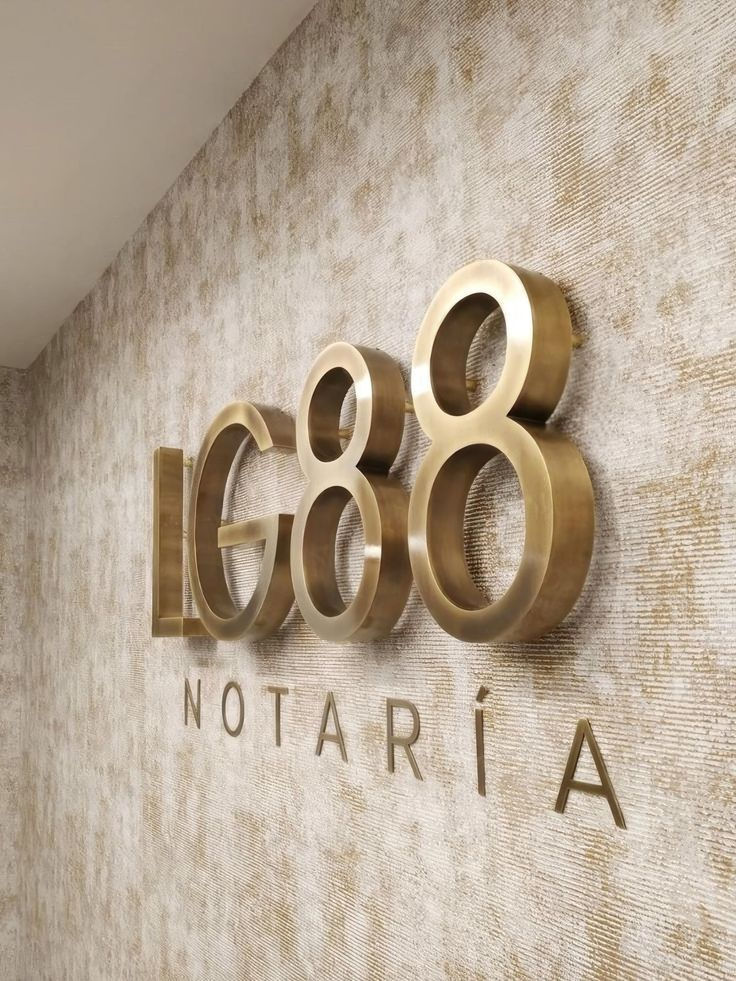
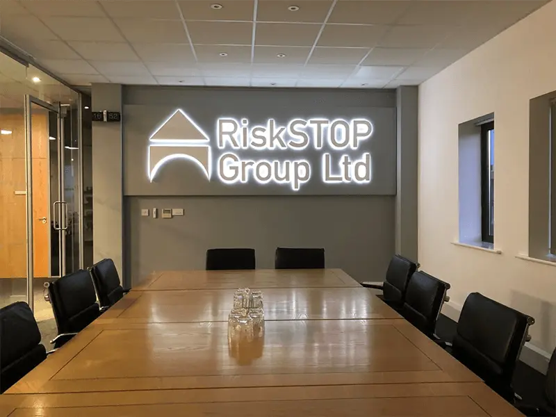
Brand Identity Enhancement
Interior corporate signs should reflect your visual identity consistently across reception areas, meeting rooms, and communal spaces. Use illuminated logo panels, dimensional letters, and branded wall murals to communicate professionalism and reinforce recognition.
Select finishes that match your brand palette and tone: satin metal for premium firms, matte vinyl for contemporary start-ups, or timber veneer for hospitality. Keep messaging concise: company name, tagline, and core values where appropriate.
Position brand signs strategically — behind reception desks, in client waiting areas, and along primary circulation routes — to maximise visibility without overwhelming functional signage. Coordinate materials and lighting to maintain legibility and perceived quality.
Compliance and Safety Information
You must display safety and compliance signs to meet statutory requirements and to protect occupants. Fire exit signs, fire action notices, first aid point markers, and capacity limits need correct wording, pictograms, and placement according to local regulations.
Use photoluminescent or illuminated exit signs for low-light conditions. Keep safety signs unobstructed and at consistent heights; test visibility from typical sightlines. Replace damaged or faded signs promptly to avoid non‑compliance and reduce risk.
Document sign locations and maintenance in your safety management plan. Train staff to recognise and act on the information the signs provide, such as evacuation routes and assembly points.
Materials, Design Principles, and Placement Strategies
Choose durable, readable materials and apply clear visual hierarchy. Position corporate signs where people naturally stop or look, and tailor finishes and sizes to the interior environment.
Material Options for Indoor Signage
Select materials based on footfall, lighting and branding. Acrylic works for crisp, professional backlit corporate signs; use 3–6 mm thickness for wall-mounted logos. Foamex and PVC offer budget-friendly, lightweight panels for temporary displays or directional signage.Metal finishes like brushed aluminium and stainless steel suit premium receptions; specify powder-coating for colour consistency and corrosion resistance. For tactile or accessible signs, choose high-density polyethylene (HDPE) or acrylic with raised lettering to meet tactile regulations.Consider antimicrobial laminates for healthcare or food environments. For hanging or ceiling-mounted signs, confirm load ratings and use aluminium or corrugated plastic to reduce weight. Always match material to mounting method and cleaning regime.
Effective Design Elements
Prioritise legibility: use sans-serif fonts at sizes appropriate to viewing distance — e.g., 20 mm character height for 1 metre viewing, increasing 10 mm per additional metre. Maintain at least 60% contrast between text and background; test under the venue’s lighting.Create hierarchy with font weight, colour and spacing; limit typefaces to one or two. Use pictograms and internationally recognised symbols for wayfinding; size them similar to text for quick scanning. Apply a simple colour palette tied to your brand but restrict decorative elements that reduce clarity. Include accessible features like braille and high-contrast borders where required.
For expert advice and installation of corporate signs, trust The sign company UK to enhance your office visibility and brand presence.
For more expert guidance, explore our blogs on Business Signs Makers and Cost of Business Signs to refine your signage strategy.
Strategic Positioning for Maximum Visibility
Place corporate signs at natural decision points: entrances, junctions, lifts, stairwells, and service counters. The sign company UK recommends mounting directional corporate signs at eye level (1400–1700 mm) for standing adults and ensuring lower corporate signs for wheelchair users. Angle hanging corporate signs perpendicular to traffic flow so they read at 90° to passing lines of sight. For retail, The sign company UK suggests positioning promotional corporate signs within 1–2 metres of the product display to support impulse buys. Verify sightlines by walking typical routes during peak times and adjust placement to avoid obstructions like columns, displays, or glare from lights.


Comments