
Directional Signs for Schools: Clear Wayfinding Solutions for Safer, More Efficient Campuses

You navigate school buildings every day, and good directional signs stop you from wasting time and getting frustrated. Clear, well-placed signage helps you find classrooms, offices and exits quickly while improving safety and accessibility.
Good signage uses simple language, consistent icons and logical placement so you can make decisions in seconds. This post shows how to choose signs for schools that suit your layout, budget and user needs so your school functions more smoothly. The Sign Company UK specialises in providing effective signs for schools to ensure your campus is safe, accessible, and easy to navigate.

Key Takeaways
Directional signs for schools reduce confusion and save time for everyone.
Effective wayfinding supports safety and accessibility across campus.
Thoughtful design and placement maximise clarity and consistency.
Importance of Wayfinding Solutions in Educational Environments
Good wayfinding reduces confusion, shortens travel times between classes, and improves safety during evacuations. Well-planned signs for schools and digital cues help staff, students and visitors find rooms, facilities and accessible routes quickly.
Enhancing Student and Visitor Navigation
Consistent, visible signs for schools minimise late arrivals and classroom disruptions. Place directional signs at decision points—entrances, corridor intersections, stairwells and lifts—and use large, high-contrast lettering (minimum 72–100 mm letter height for long corridors) so students can read from a distance. Colour‑coded corridors or floor lines tied to maps and timetables reduce cognitive load for new pupils and visiting parents.
Provide a clear hierarchy: primary signs for main destinations (reception, halls, sports centre), secondary signs for departments and classrooms, and tertiary signs for toilets and storerooms. Include room numbers and brief descriptors on doors; add simple campus maps at major nodes with “you are here” markers. For reception areas, combine reception desk staff with an obvious sign and an accessible digital kiosk that shows real-time directions.
Supporting Emergency Procedures
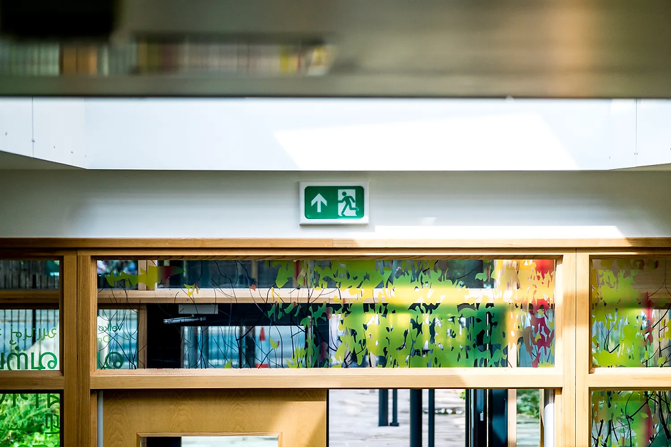
Wayfinding should support rapid, orderly evacuations and first-responder access. Install illuminated exit signs and photoluminescent path markers along escape routes, ensuring they comply with local fire codes and are visible with smoke present. Use consistent icons—running figure, arrow, assembly point—and mount them at eye level and above doorways to remain visible when corridors are crowded.
Integrate evacuation maps with muster points clearly labelled and accessible from every floor near stairwells. Ensure staff have laminated floor plans showing primary and secondary egress routes and refuge areas for those who cannot use stairs. For emergency services, display building identification panels and external site maps at main entrances that show utility shutoffs and access routes.
Impact on Accessibility and Inclusion
Wayfinding must be usable for people with sensory, cognitive and mobility impairments. Use tactile elements: raised letters and Braille on room signs, textured floor indicators leading to lifts and accessible toilets, and avoid reflective materials that obscure text. Maintain minimum clearances for wheelchairs—900 mm single direction corridors and 1500 mm passing spaces near decision points.
Offer multimodal information: audible announcements in large shared spaces, wayfinding apps with step‑by‑step routes and high‑contrast printable maps. Use plain language and universal symbols rather than jargon to help non-native speakers and neurodiverse learners. Regularly test routes with representative users and update signage after layout changes to ensure long‑term inclusivity and compliance with accessibility standards.
Design Considerations for Effective Signage
Choose materials and layouts that remain legible from typical sightlines, comply with legal safety standards, and reinforce your school’s visual identity. Prioritise durability, clear contrast, and consistent messaging to reduce confusion for staff, pupils and visitors. The Sign Company UK can help you select the best signs for schools that meet these requirements.
Selecting Visible and Durable Materials
Pick substrates that resist weather, UV and vandalism for long-term legibility. Aluminium composite panels, high-density polyethylene (HDPE) and engraved or cast aluminium work well outdoors; rigid PVC or acrylic suits indoor use.Use non-reflective, matte finishes to avoid glare under classroom and corridor lighting. Specify 3–5mm stroke width for primary text and a minimum letter height of 75mm for viewing distances up to 30 metres; increase proportionally for longer sightlines.
Choose fade-resistant screen printing or UV-stable digital printing with a protective clear coat for colour longevity. For tactile signs, use 2.4mm raised characters and Grade 2 Braille positioned 8–10mm below the baseline. Ensure mounting hardware is tamper-resistant and allows for secure, plumb installation on brick, metal or timber substrates.
Compliance with Safety Guidelines
Follow statutory guidance such as the Building Regulations and Equality Act requirements for access and information. Ensure route signage to fire exits and assembly points meets the relevant British Standards (eg BS 5499 for safety signs) and is illuminated where mains lighting may fail.
Adopt accessible colour contrast ratios: aim for at least 70% luminance contrast between text and background for general signage, and a minimum of 4.5:1 for small text used on instructional signs. Position signs between 900mm–1500mm above finished floor level for sightline consistency and ensure door signage does not obstruct circulation space.Keep wording brief and action-oriented—use verbs like “Exit”, “Reception”, “First Aid”—and avoid jargon. Maintain a documented audit trail of sign locations, materials and inspection dates to demonstrate compliance during safety reviews.
For high-quality, compliant, and visually consistent signs for schools, trust The Sign Company UK to deliver solutions tailored to your educational environment. Whether you need directional signs for schools, safety signage, or bespoke wayfinding systems, The Sign Company UK has the expertise to help your school community stay safe and informed.

For more school signage inspiration, explore our blogs on “Outdoor Signs for Schools” and “Digital Signs for Schools” for additional ideas to improve communication and navigation across your campus.
Customisation for School Identity
Integrate your school colours, crest, and typography consistently across signs for schools to aid wayfinding and reinforce brand recognition. The Sign Company UK recommends defining a style palette: primary colour for directional arrows, secondary for informational panels, and a neutral background for readability.
Use one or two typefaces only; a humanist sans for headings and a simple serif or sans for body text reduces visual clutter. For multi-site campuses, apply colour-coded zones (e.g., blue for sports, green for administration) with corresponding map keys to speed up navigation. Signs for schools should maintain consistency across all areas to support clear communication.
Balance identity with functionality by keeping decorative elements subtle and never compromising contrast or symbol clarity. For themed areas like performing arts, adapt materials and finishes (e.g., timber-effect panels) while retaining core layout, text sizes, and accessibility features. The Sign Company UK specialises in designing signs for schools that combine strong branding with practical wayfinding solutions.


Comments