
Architectural Signage: Designing Effective Wayfinding Systems

Architectural signs help you identify, navigate and understand a built environment. From entrance signs and directories to room labels and regulatory notices, each element supports movement while reinforcing the character of a site.
You create more accessible, efficient spaces when you plan architectural signs around user needs, visibility, durability and legal requirements. The right materials, finishes, placement and maintenance strategy help your architectural signs remain clear and effective over time.
Key Takeaways
You can use architectural signs to improve navigation and reinforce a building’s identity.
You should match materials and placement to the space and its users.
You must consider accessibility, regulations, installation and maintenance.

Purpose And Core Functions
Architectural signs help you find destinations, understand a building’s layout and recognise an organisation’s presence. Effective systems combine clear information, consistent placement and materials that suit the building’s use, audience and environment.
Wayfinding And Navigation
You use wayfinding architectural signs to move through a building or site with fewer delays and errors. Directional signs identify routes to entrances, reception areas, lifts, stairs, toilets, meeting rooms, exits and other key destinations. Place them at decision points, such as junctions, lobby entrances and changes of level, rather than only beside the destination.
Use concise wording, familiar symbols and strong contrast between text and background. Consistent arrows, naming conventions and sign positions help you interpret information quickly. For larger sites, colour zones, numbered rooms and directory panels can support a clear navigation sequence from the main entrance to the final destination.
Accessibility also affects sign placement and design. Provide tactile lettering and Braille where required, maintain readable type sizes, avoid glare and position signs so people using wheelchairs can reach them. Coordinate wall signs, suspended signs and digital displays with lighting, furniture and other visual information.
Brand Expression And Identity
Architectural signs express your organisation’s identity through its name, logo, colours, typography, materials and lighting. Apply these elements consistently across entrance signs, reception displays, room identifiers, directories and external markers so visitors can connect each location with the same organisation.
Your architectural signs should reflect the building’s character and operating needs. A law firm may choose restrained lettering and durable metal finishes, while a cultural venue may use flexible graphics and more distinctive colour applications. Select materials such as aluminium, stainless steel, acrylic, timber or powder-coated steel according to exposure, maintenance requirements and the desired visual effect.
Keep brand elements subordinate to essential information where people need to navigate. Use the primary identity prominently at arrival points, then apply smaller brand details to directional and identification signs. Illumination should improve visibility without creating glare, light spill or unnecessary energy use.
Planning For Users And Spaces
Effective architectural signs help people find, understand and use a space without unnecessary effort. You need to match each sign’s content, format and position to user abilities, movement patterns and the building’s layout.
Audience Needs And Accessibility
Identify who will use the building, including visitors, staff, children, older people and people with visual, hearing, cognitive or mobility impairments. Use plain language, familiar symbols and consistent terms throughout the site. Provide essential information in accessible formats, such as tactile lettering, Grade 2 Braille and high-contrast text.
Set lettering at a readable size and select typefaces with clear character shapes. Strong contrast between text and background improves legibility, while matt finishes reduce glare. Place signs where users can approach them safely, without obstruction, and include tactile information within comfortable reach.
Consider different journeys through the building. A visitor who cannot read a wall-mounted sign easily may need directional cues, audible information or a clearly marked help point. Check proposed locations from seated and standing positions, and test the system with representative users before manufacture.
Information Hierarchy And Placement
Organise information according to what users need at each decision point. Primary signs identify entrances, destinations and major routes; secondary signs direct people to rooms, facilities and exits; identification signs confirm that they have reached the correct location. Keep each sign focused on one clear action or message.
Place directional signs before junctions, lifts, stairs and changes in level, giving users enough time to choose a route. Repeat key information after major turns so they can confirm their progress. Position room identification signs consistently beside doors rather than directly on moving panels.
Use a coordinated system of colour, numbering, symbols and typography. Limit the number of destinations shown on one sign, group related information together and prioritise the most important route. Check sightlines from normal walking paths, account for furniture and queues, and avoid placing architectural signs where lighting, reflections or competing displays reduce visibility.
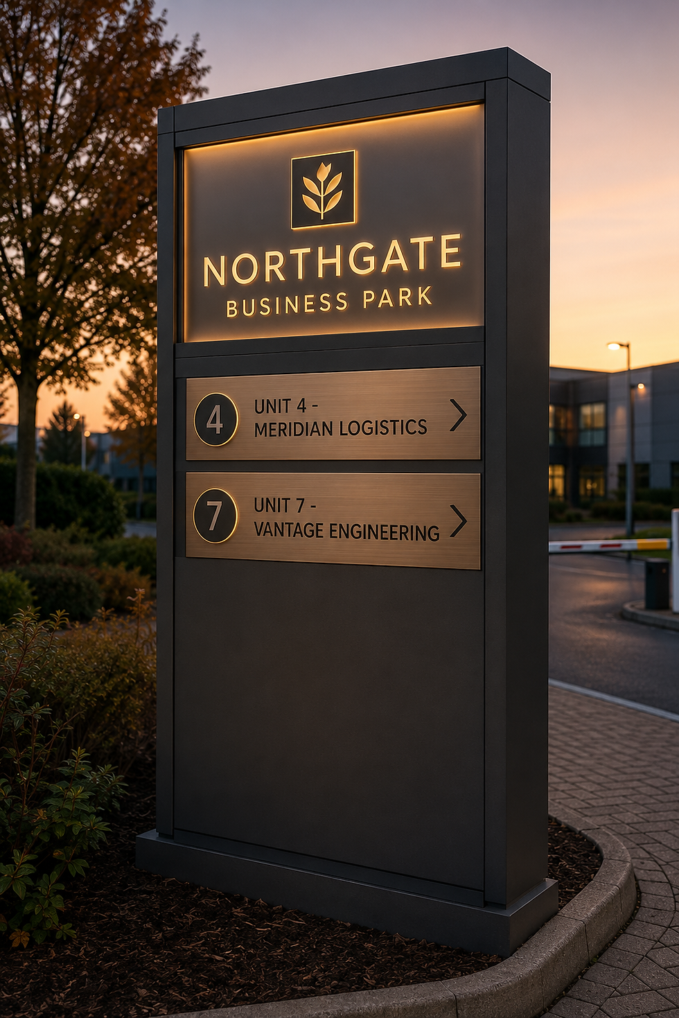
Materials, Finishes And Durability
Your material and finish choices affect legibility, maintenance, cost and the expected service life of architectural signs. Match each specification to the sign’s location, exposure, viewing distance and required visual character.
Interior Material Options
For internal architectural signs, you can choose from acrylic, aluminium, timber, glass, stainless steel and painted MDF. Acrylic provides clean colour, translucency and easy cleaning, while powder-coated aluminium offers a durable, lightweight surface for directories, room signs and suspended systems. Timber and timber veneer add warmth but require controlled indoor conditions to prevent warping or splitting.
Select the finish according to how people will use the space. Matt or satin surfaces reduce reflections and improve readability under strong lighting. Brushed metal hides minor marks better than polished metal, and digitally printed graphics should receive a protective laminate where frequent contact or cleaning could cause wear.
Check that inks, adhesives and coatings suit the building’s conditions. High-traffic areas may need scratch-resistant faces, tamper-resistant fixings and rounded edges. For accessible architectural signs, use strong contrast, tactile lettering and Grade 1 Braille where required by the project specification.
External Weather Resistance
External architectural signs must withstand rain, ultraviolet light, temperature changes, wind and airborne pollutants. Powder-coated aluminium, stainless steel and high-pressure laminate provide reliable options when you specify suitable grades and protective finishes. Use marine-grade stainless steel near coastal locations, where salt can accelerate corrosion.
Choose UV-stable pigments, films and clear coats to reduce fading. Avoid finishes that trap water around joints, and design drainage paths so moisture cannot collect behind panels or within built-up letters. Seal penetrations carefully, while allowing compatible materials to expand and contract at different rates.
Your fixing system also affects durability. Use corrosion-resistant fasteners, isolate dissimilar metals to prevent galvanic corrosion, and specify brackets that can withstand local wind loads. Include a planned cleaning schedule, particularly for architectural signs near roads, industrial sites or coastal areas, because deposited dirt and salt can shorten the service life of otherwise durable materials.
Design Standards And Compliance
You must design architectural signs for clear communication, safe movement and compliance with applicable building regulations. Your specifications should address viewing distance, contrast, accessibility, materials, mounting heights and local approval requirements.
Legibility And Visual Contrast
Use sans-serif typefaces, consistent letter spacing and sentence case where practical. Choose a letter height that suits the viewing distance, and avoid condensed fonts, decorative styles and tightly packed lines that reduce recognition.
Provide strong contrast between lettering and its background. Dark lettering on a light, matt surface or light lettering on a dark, matt surface usually performs better than low-contrast combinations. Avoid glossy finishes, which can create reflections and obscure information under direct lighting.
Limit each sign to essential information. Use recognised symbols alongside text where they improve understanding, particularly for toilets, lifts, exits and accessible facilities. Maintain consistent colours, arrows, terminology and positioning throughout the building so users can interpret architectural signs quickly.
For accessible architectural signs, use tactile lettering and Grade 1 Braille where required by the relevant standard. Position these signs where users can approach them safely and read them without obstruction.
Safety And Regulatory Requirements
Check your design against the building regulations, accessibility standards, fire safety requirements and planning controls that apply to the site. Requirements vary by location and building type, so obtain approval from the responsible authority before manufacture or installation.
Keep emergency and fire safety architectural signs distinct from general wayfinding. Use approved colours, symbols and illumination, and ensure escape-route signs remain visible during power failure where required. Never place decorative elements, advertisements or movable objects where they could conceal safety information.
Specify secure fixings, rounded edges and materials suitable for the installation environment. External architectural signs should resist wind, moisture, ultraviolet exposure and corrosion, while internal signs must not create trip hazards or obstruct doors, corridors, handrails or firefighting equipment.
Record sign locations, dimensions, materials and maintenance responsibilities in the project documentation. Schedule inspections to replace damaged, faded or poorly illuminated signs promptly.

Installation And Long-Term Management
Accurate surveys, suitable fixings and planned access help you install architectural signs safely and consistently. Documenting materials, cleaning methods and replacement requirements also protects appearance, compliance and service life.
Site Surveys And Mounting Methods
Before fabrication, survey the wall, entrance, paving and nearby services. Record dimensions, levels, sightlines, substrate type, moisture exposure and any restrictions on drilling or access equipment. Check proposed positions against planning conditions, accessibility requirements, fire routes and electrical regulations.
Select fixings for the actual substrate and sign load. Masonry may require resin anchors or expansion fixings, while cladding often needs brackets connected to structural supports rather than the outer panel. Use corrosion-resistant stainless steel or suitably coated components in exposed locations. Keep fixings concealed where the design requires a clean finish, but retain access for inspection.
Confirm cable routes, transformer locations and drainage before installing illuminated architectural signs. Seal penetrations, prevent water tracking and allow ventilation around electrical components. Provide safe working space for installers and future maintenance teams, especially above entrances or beside busy pedestrian routes.
For expert guidance and high-quality architectural signs, The Sign Company UK offers comprehensive solutions—from design and compliance to installation and ongoing maintenance. Trust The Sign Company UK to deliver architectural signs that enhance wayfinding, express your brand, and meet all regulatory standards. For your next project, partner with The Sign Company UK for reliable, effective architectural signs.
For a deeper look at the principles behind effective navigation, explore our blog, “Architectural Wayfinding,” for insights into creating clear, intuitive, and engaging spaces.
Maintenance And Replacement Planning
Create an asset register for each sign, including its location, dimensions, materials, finish, lighting type, fixing details and installation date. Set inspection intervals according to exposure and use. External architectural signs may need checks for corrosion, loose fixings, fading, water ingress and impact damage at least annually, with more frequent inspections in coastal or high-traffic areas. The Sign Company UK recommends thorough inspections to ensure all architectural signs remain in optimal condition.
Use manufacturer-approved cleaning methods. A soft cloth, clean water and a mild, non-abrasive detergent usually protect painted, vinyl and acrylic surfaces; avoid solvents, pressure washing and abrasive pads unless the specification permits them. Test illuminated architectural signs for failed modules, uneven brightness, damaged wiring and overheating. The Sign Company UK suggests regular maintenance to prolong the lifespan of your architectural signs.
Keep records of colour references, typefaces, artwork files, LED specifications and approved suppliers. When you replace a component, match its finish and brightness, inspect adjacent fixings and update the asset register. Schedule major replacements alongside refurbishment or access works to reduce disruption and equipment costs. The Sign Company UK can assist with planning and maintaining your architectural signs for long-term reliability.


Comments